Ascent Illustration Library
My Role:
Mentored and provided feedback throughout the creation and development process
Brought design system expertise to guide the structure of the illustration library
Authored usage guidelines for cross-team adoption and illustration usage
Established a contribution process for other teams to leverage and expand the library
Acted as the primary contact for illustration requests across the organization
Assisted in creating core illustration assets
Overview:
Before this project, there was no consistent illustration style or centralized library within the product. While the Design System controlled some visual consistency, teams often created illustrations independently, leading to a disjointed user experience. This highlighted an opportunity to introduce a unified illustration system that not only improved cohesion but also brought more warmth and delight to the product.
I collaborated with another designer to establish Ascent’s (Klaviyo’s design system) first illustration library. This was a foundation for scalable, reusable illustration components and a more consistent visual identity across the product.
Defining the Illustration Style
The first step in establishing the illustration system was gathering feedback and insights from teams across the organization. We wanted to understand existing gaps, align on values, and explore directions before landing on a final style.
Key Activities:
Audited existing illustrations to identify inconsistencies and patterns of use
Mapped categories of illustrations to clarify the types needed across the product
Defined shared values and principles to guide the new illustration system
Facilitated brainstorming and word-mapping sessions with the design organization
Gathered key words that shaped component concepts and uncovered opportunities for illustrations across product areas
Created and shared early visual concepts to test potential directions
Distributed options through Google Forms and in-person printouts, allowing individuals across the company to vote and provide feedback
Establishing The Illustration Style
Source: RISOTTO Studio
Based on team feedback and company-wide voting, we defined an illustration style inspired by risograph printing—a technique known for its speed, efficiency, and ties to marketing history. By incorporating risograph’s signature textures and layered color overlaps, we introduced a style that feels crafted and vibrant while bringing cohesion and personality to the platform.
BUILDING THE SYSTEM
We translated the keywords gathered from the team word-mapping sessions into specific illustration concepts. Each illustration was built as a reusable component in Figma and organized into categories, making the library easy to maintain, scale, and navigate for designers across the organization.
Above are examples of the different illustration categories and how they appear within the product. Each category serves a distinct purpose and is supported by clear guidelines to ensure consistent usage.
Sample Testing and Metrics
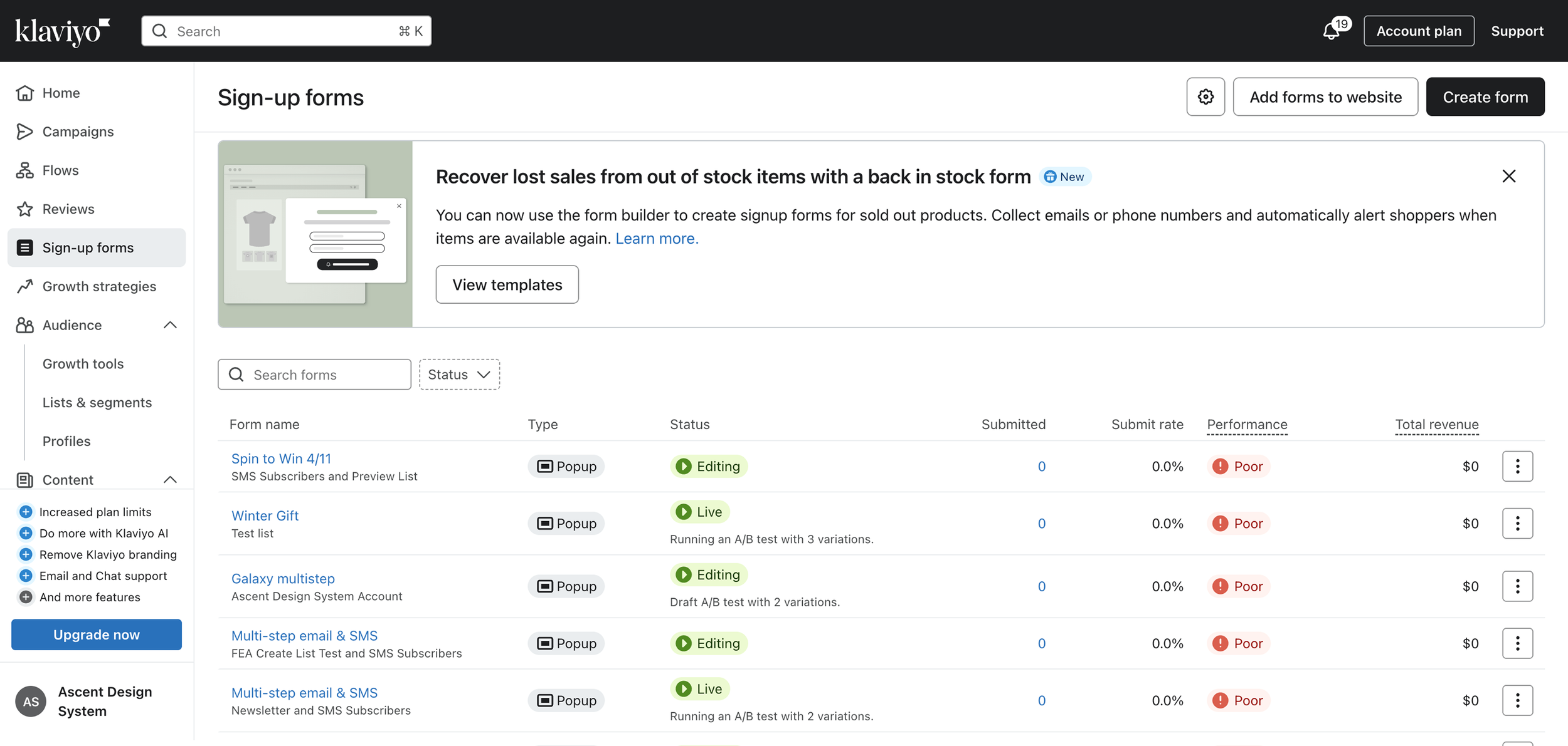
Before rolling out the new illustration system, we ran a sample test to measure impact. We updated an existing announcement banner in the product with one of the new illustrations and tracked engagement metrics. Using Heap, we compared interactions before and after the update and saw a 19% increase in engagement on the same day of the swap, compared to the previous week’s performance. That day also marked the highest engagement the banner had received to date.
This result validated the new illustration direction and gave us the confidence to expand the updates across the rest of the product.
Previous banner
Updated banner with new illustration


