
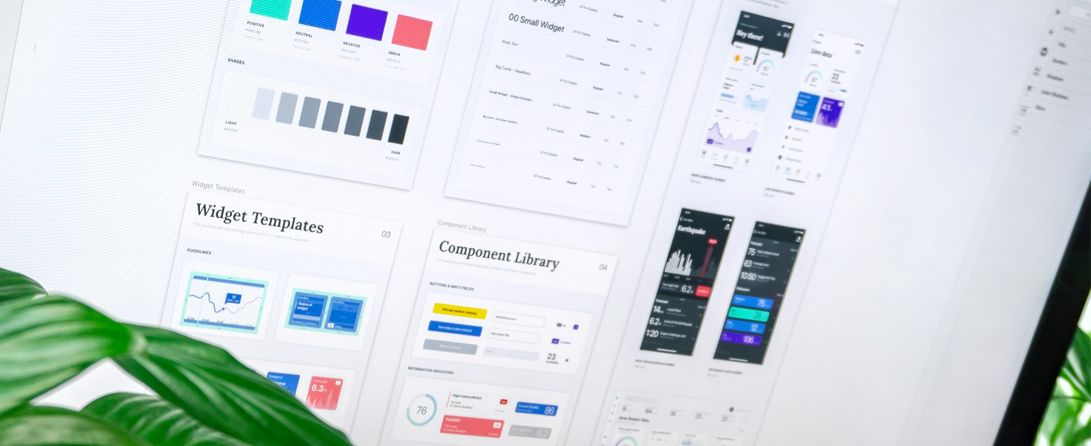
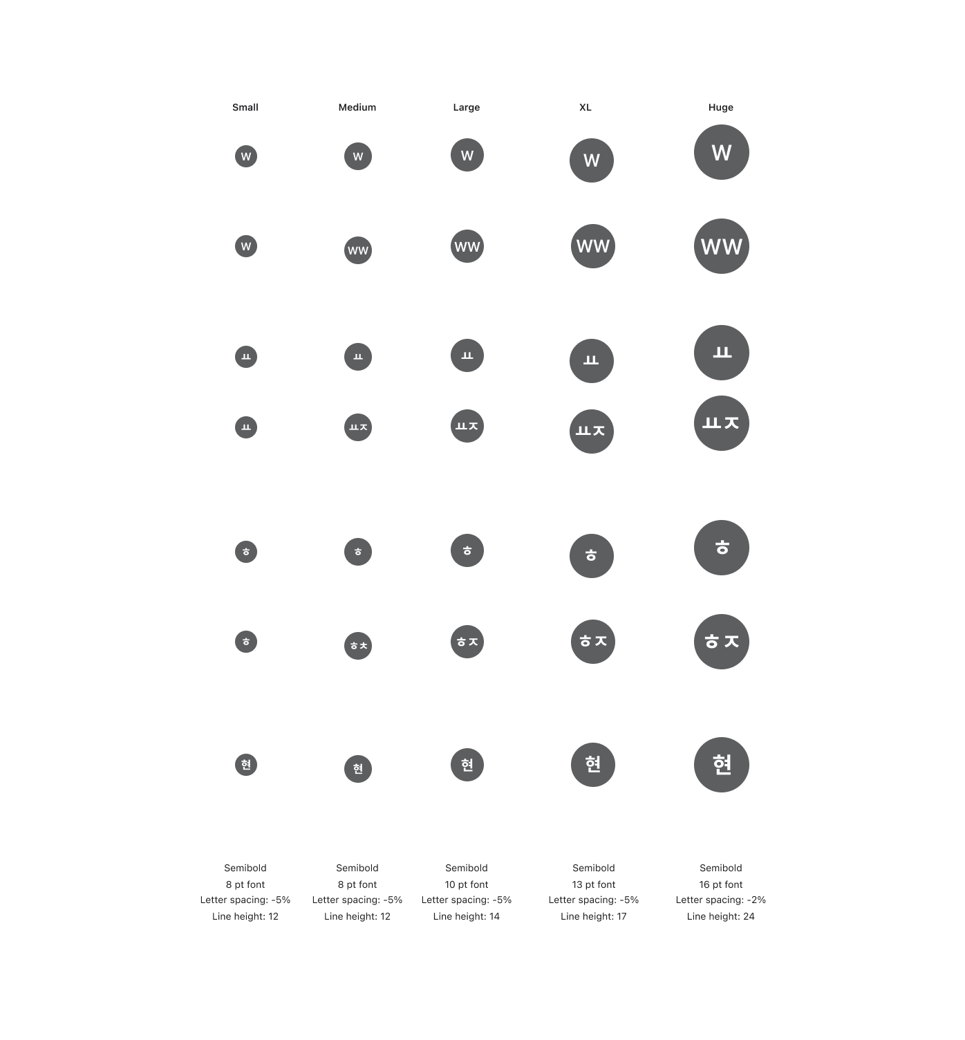
Component Work: Ascent Design System
Overview: Design systems thrive on reliable, reusable components. While on the Ascent Design System team at Klaviyo, I contributed to the creation and refinement of UI elements such as color pickers, date range pickers, skeleton loaders, and progress bars. My focus was on ensuring accessibility, consistency, and scalability to support product teams building with the system. This page highlights a selection of those components and the details behind my contributions.
Programs Used: Figma, FigJam, Storybook, Google Docs, and Google Slides
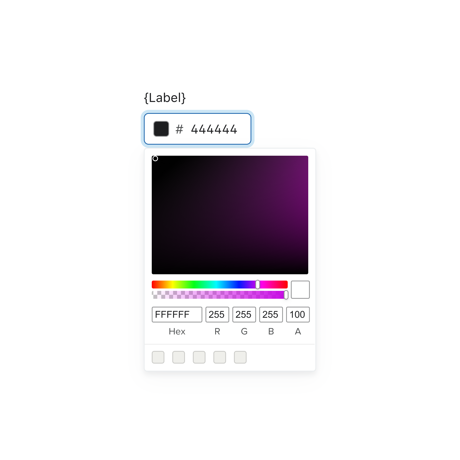
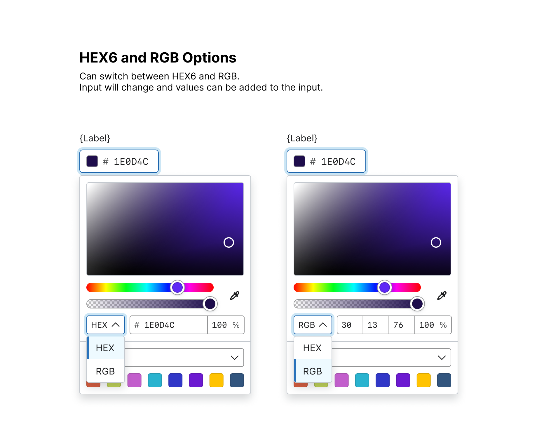
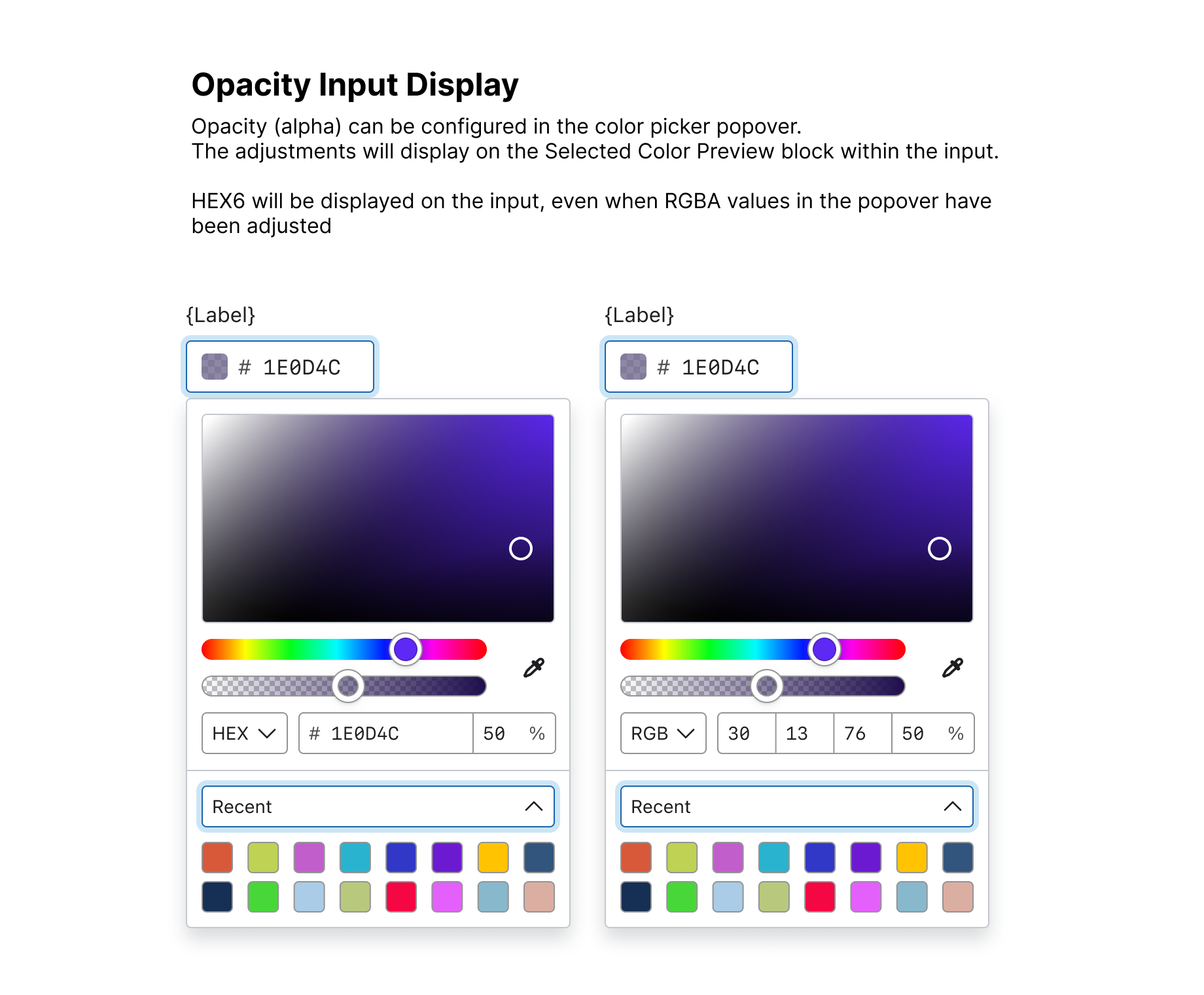
Color Picker Refresh
Background: The previous Color Picker lacked support for custom functionality, such as an eyedropper tool for selecting existing colors in a template. It also presented challenges with internationalization and accessibility due to limitations in the underlying framework.
Overview:
Refactoring the Color Picker addressed performance, usability, and accessibility issues while enabling new custom functionality. I collaborated with a Component Library Engineer to evaluate and adopt a modern library to replace the outdated implementation. I led the design of the updated component, ensuring flexibility, accessibility, and scalability within the system.
Previous
Update
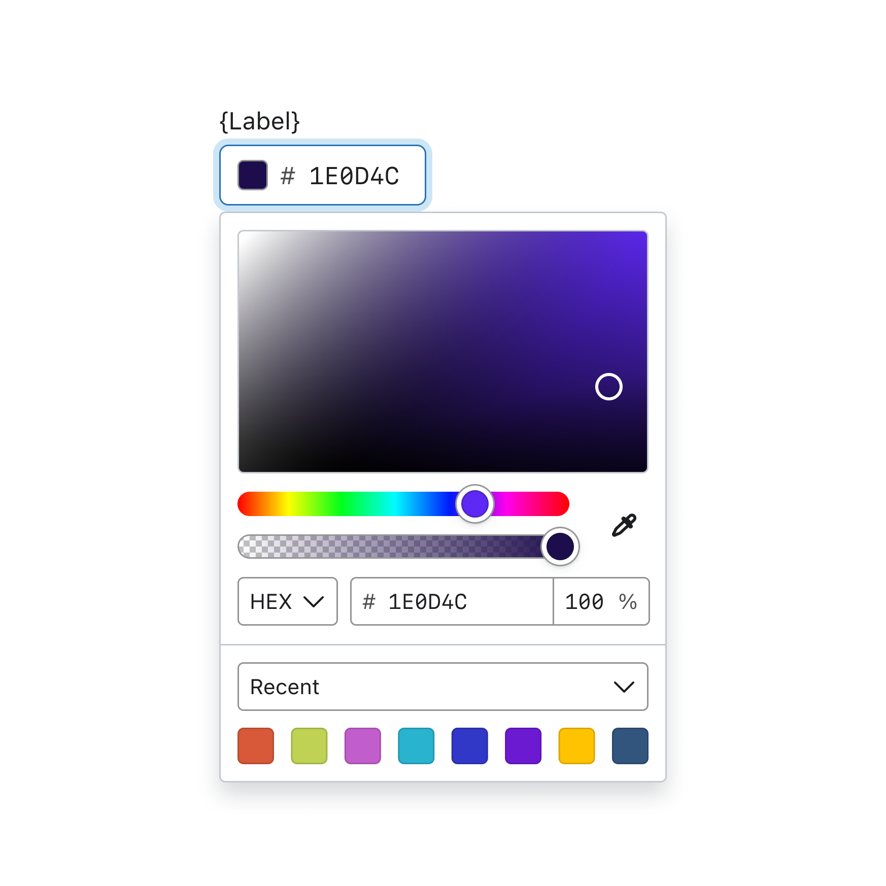
Design Update Highlights:
A way to implement custom functionality
Addition of an eye dropper for picking other existing colors in the template
Ability to select different color palettes
Improved usability
Increased sizing and style of selection indicators
Ability to select between different color modes


Avatar Enhancement
Background: We were solving for a use case where a company may have multiple sub-brands and would like to distinguish each brand through different color avatars. A team working to improve the account switching experience, wanted a way to help with easier scan-ability.
At the time, the avatar component did not support custom colors. Part of this work also included establishing accessible color combinations that met contrast requirements.
Outcome:
We enhanced the monogram avatar component by introducing preset color options, ensuring they met AA accessibility standards, and enabling teams to pass through custom colors. Additional improvements included support for two-letter initials (previously unsupported) and updated typography for better legibility across component sizes.
Design Enhancement Highlights:
Flexibility of component
Ability to pass through various colors
Established accessible preset colors for teams to utilize (meeting AA accessibility standards)
Factoring two letter initials within the component that was not available previously
Visual updates to typography to fit better within all sizes of the component
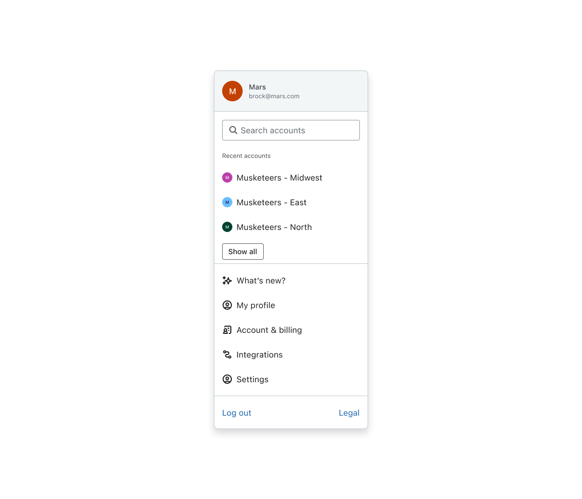
Component Enhancement & Cross-collaboration
During this project, I partnered with another product team that was improving the account-switching experience. To support their work, we enhanced the avatar component in our design system, ensuring it could meet the new requirements.
These updates are reflected in the account menu (as shown on the left).
Colors
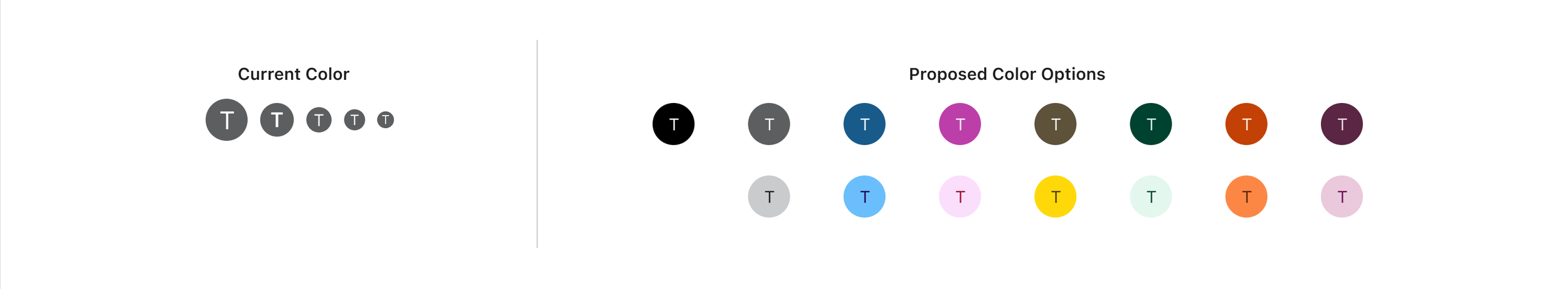
The previous avatar component did not allow for any other colors except gray. I helped establish preset colors that teams can use but helped open up flexibility for this component, so that other colors an be passed through in code.
Typography
We refined the typography across all avatar size variants to better accommodate two-letter initials, something the previous design did not support.
Adjustments to font size and letter spacing improved legibility while maintaining balance within the component. We also accounted for characters in other languages to ensure global usability.
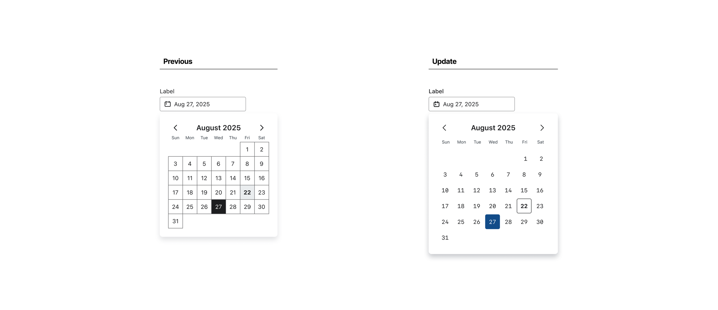
Date Picker + Date Range Picker
Background:
The previous Date Picker and Date Range Picker required updates to meet accessibility standards, support internationalization (i18n), and align with current design system guidelines. We also refined interactions and design details to improve overall usability.
Overview:
The updated Date Picker was implemented using an input field from our design system, paired with a calendar icon that triggers a pop-up calendar. These improvements ensured consistency, accessibility, and scalability across use cases.
The guidelines created for these components can be viewed here.
Date Picker: Before and After
Date Range Picker: Before and After
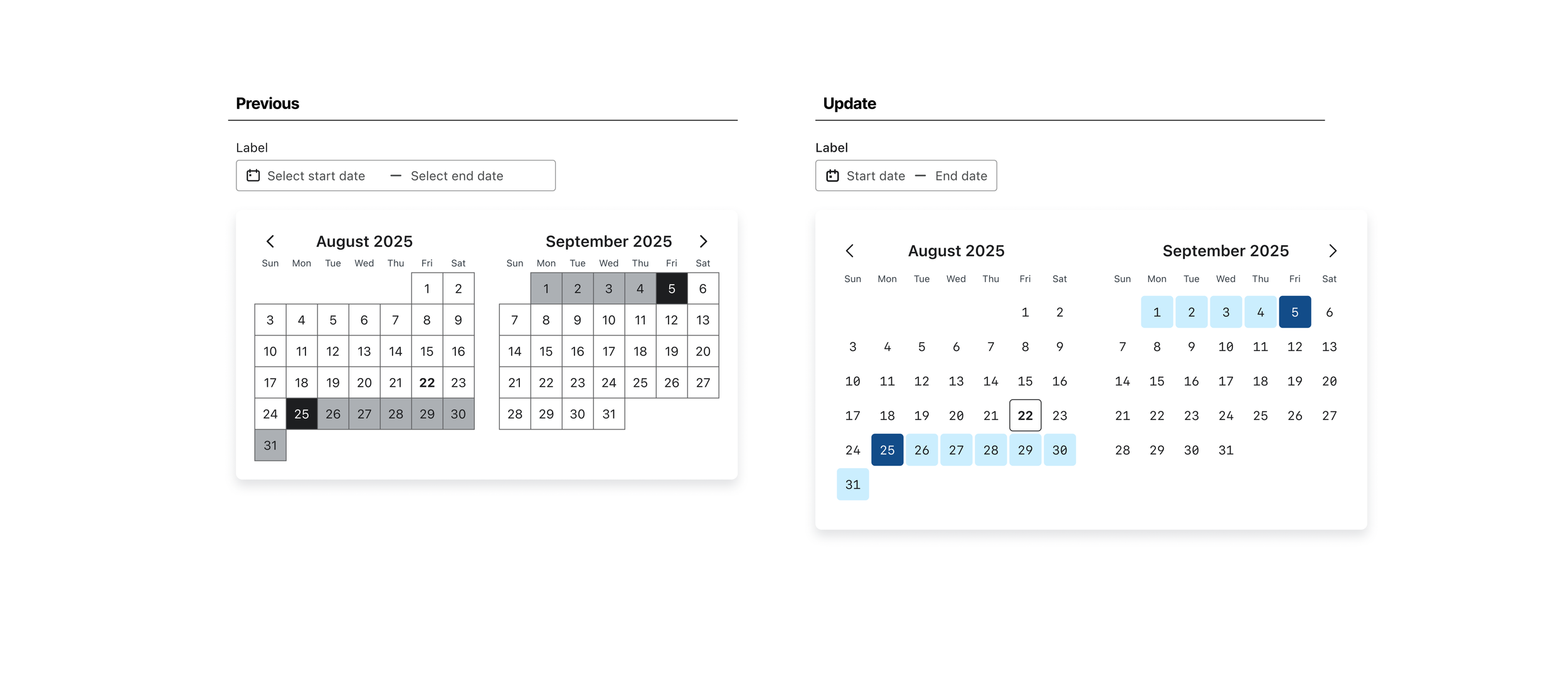
Updated Colors and Impact of Interactive States
The previous design utilized black and grays which made it a bit difficult to distinguish between specific interactive states. There was user feedback about some of the grays appearing disabled.
I introduced the use of the color blue to distinguish between specific states when selecting a certain date or date range. I created a new pattern and token in our design system with this color usage that also helped with other components in our library.
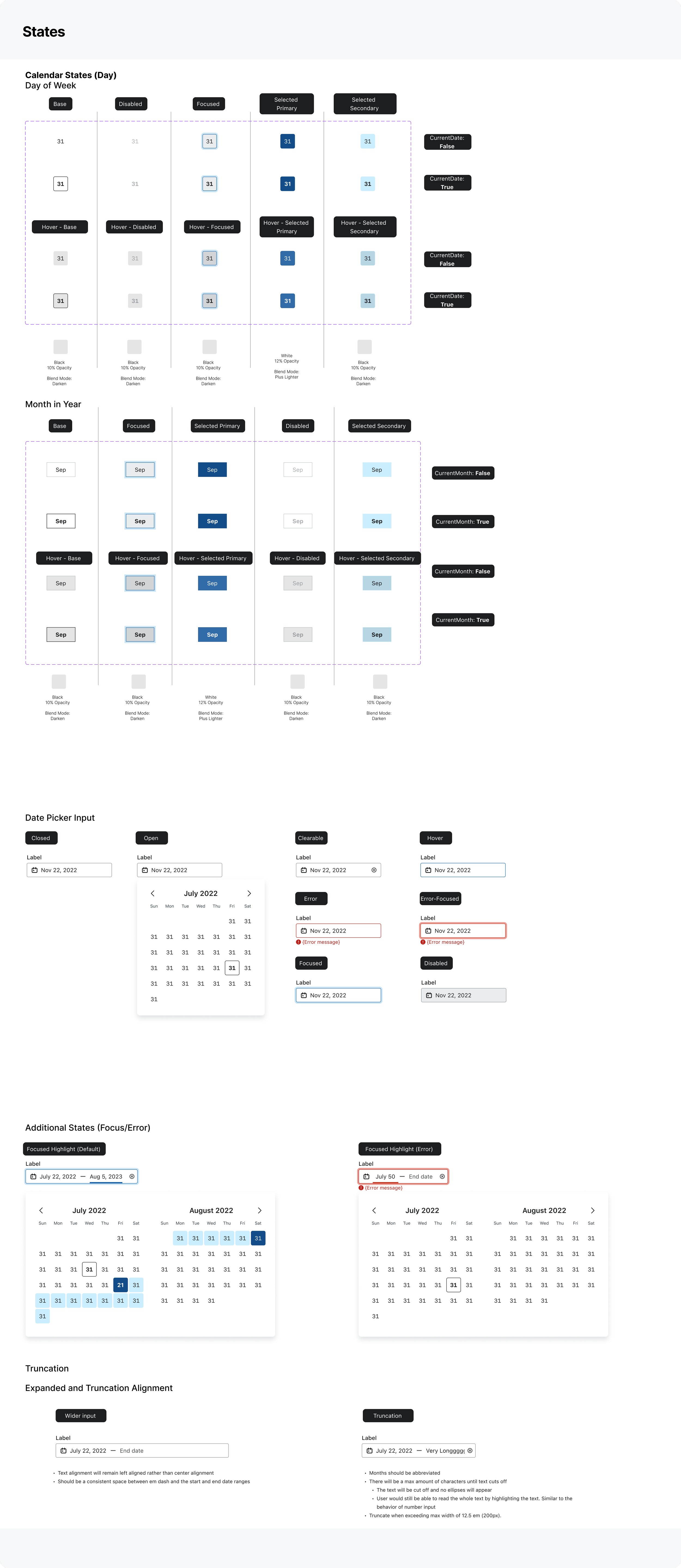
updates to focus & eRROR states

Previous version of focus and error states. These states visually didn’t look cohesive within the input.
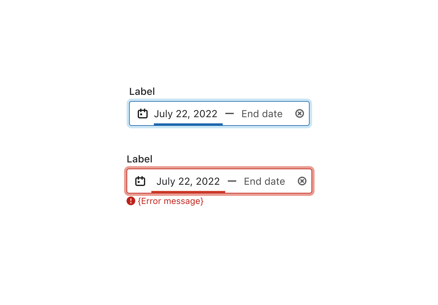
Update to focus and error states. Visual updates such as a colored ring around the entire input and a visual way to highlight the specific are of error or focus.