Product Color System
Overview: One of my first projects at Klaviyo in 2022 was creating the company’s first product color system to align the outdated UI with the refreshed brand identity. I developed scalable color scales that established a flexible foundation for the design system. These colors were integrated into our token library and are now used consistently across components.
In 2025, I revised the semantic colors to improve accessibility, making them more color-blind friendly while maintaining brand alignment. This case study highlights the process, approach, and outcomes of both efforts.
Outcome and Achievements:
An accessible color system to use across our product's user interface.
Adaptable and scalable palette that is consistent.
Ability to use a formula and pattern to create additional colors in the future.
Improvement on semantic colors to be more colorblind-friendly
Part 1: Establishing the initial color scales
Establishing The Base Colors
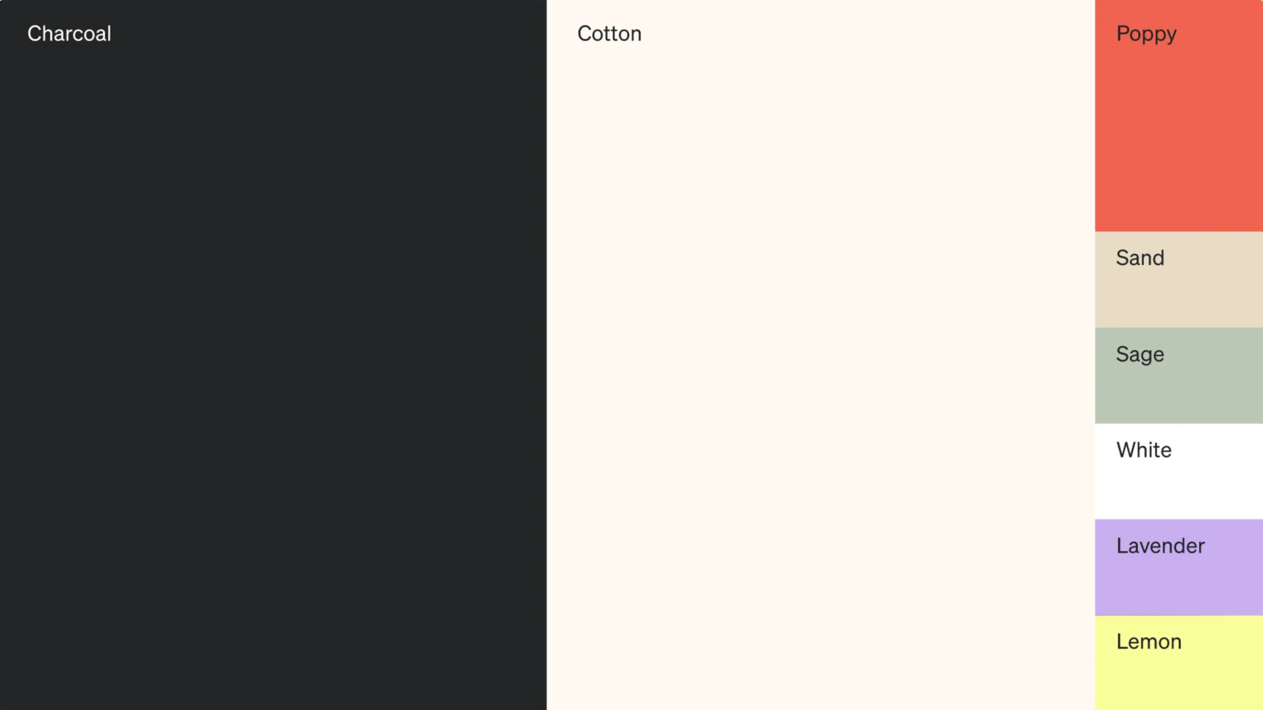
2022 Brand Colors
I experimented with HSL (hue, saturation and lightness) values to establish the initial palette. I also wanted to ensure that we kept the core marketing brand colors in mind while building the range of colors in the system.
Foremost, it was important to audit the existing colors in the current product and flag colors that were not accessible. We prioritized establishing the semantic and surface colors.
First Draft of Color Scales
Initial Draft
One of the first versions that was created was highly saturated. The lightness for each step also appeared inconsistent. Using Leonardo and manual adjustments to the HSL values, we created various iterations.
Accessibility And Contrast Ratio Scale
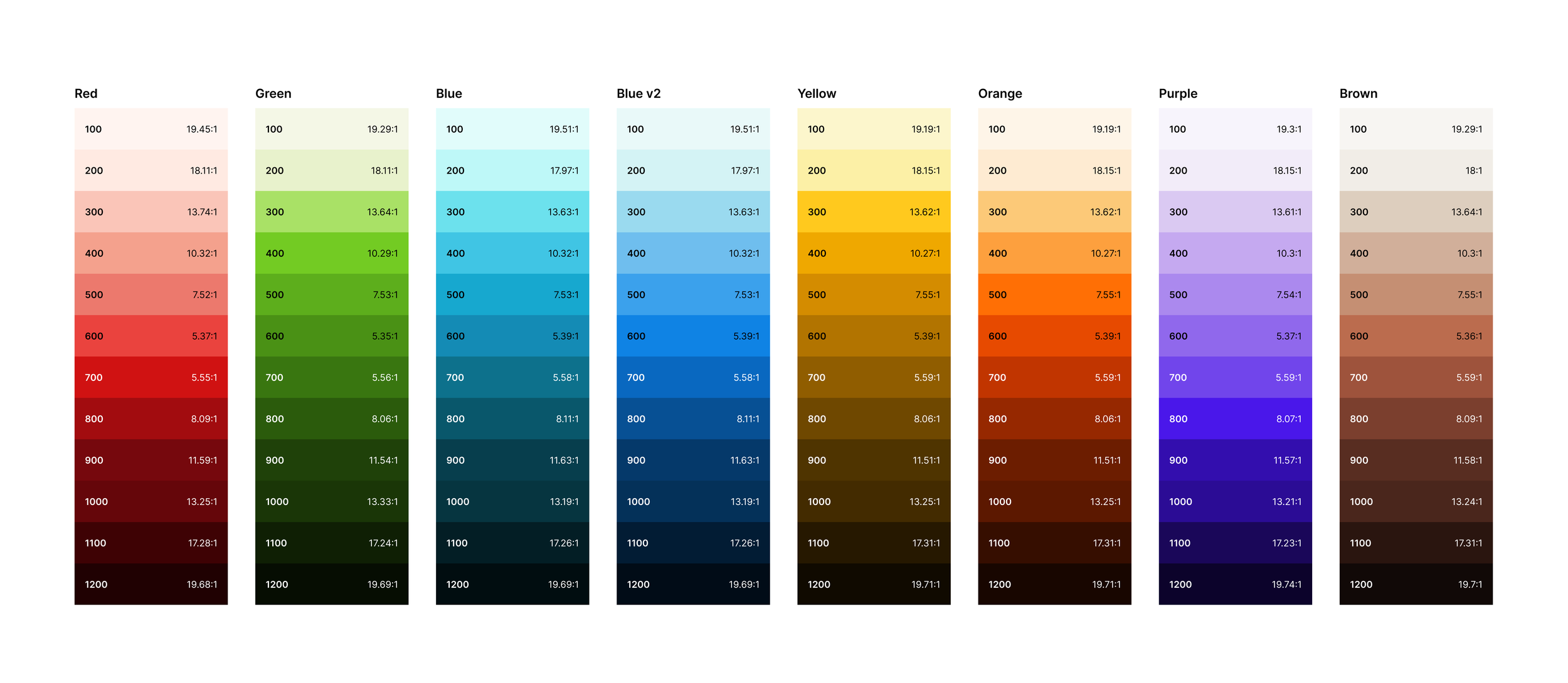
As a foundational element, we built a lightness scale that kept accessibility in mind. Color steps 95 - 600 had to be accessible with black text, while steps 700 - 1250 are accessible with white text. The goal is that all colors need to pass the minimum contrast ratio of 4.5:1.
After a few iterations, we discovered that we needed a slightly lighter tint and added 2 more steps within the original version. As a result, we landed on a total of 14 steps for each color.
Final colors and scales (first round)
Creating vibrant shades was a challenge therefore we used the shift in hue & saturation method. As the steps for each hue get darker, the saturation increases with the hue. This allowed us to create shades that were not dull or appeared washed out.
Part 2: Updating Semantic colors
Updating Semantic Colors
There were some colors that were difficult to distinguish for users with common types of colorblindness, such as red/green colors.
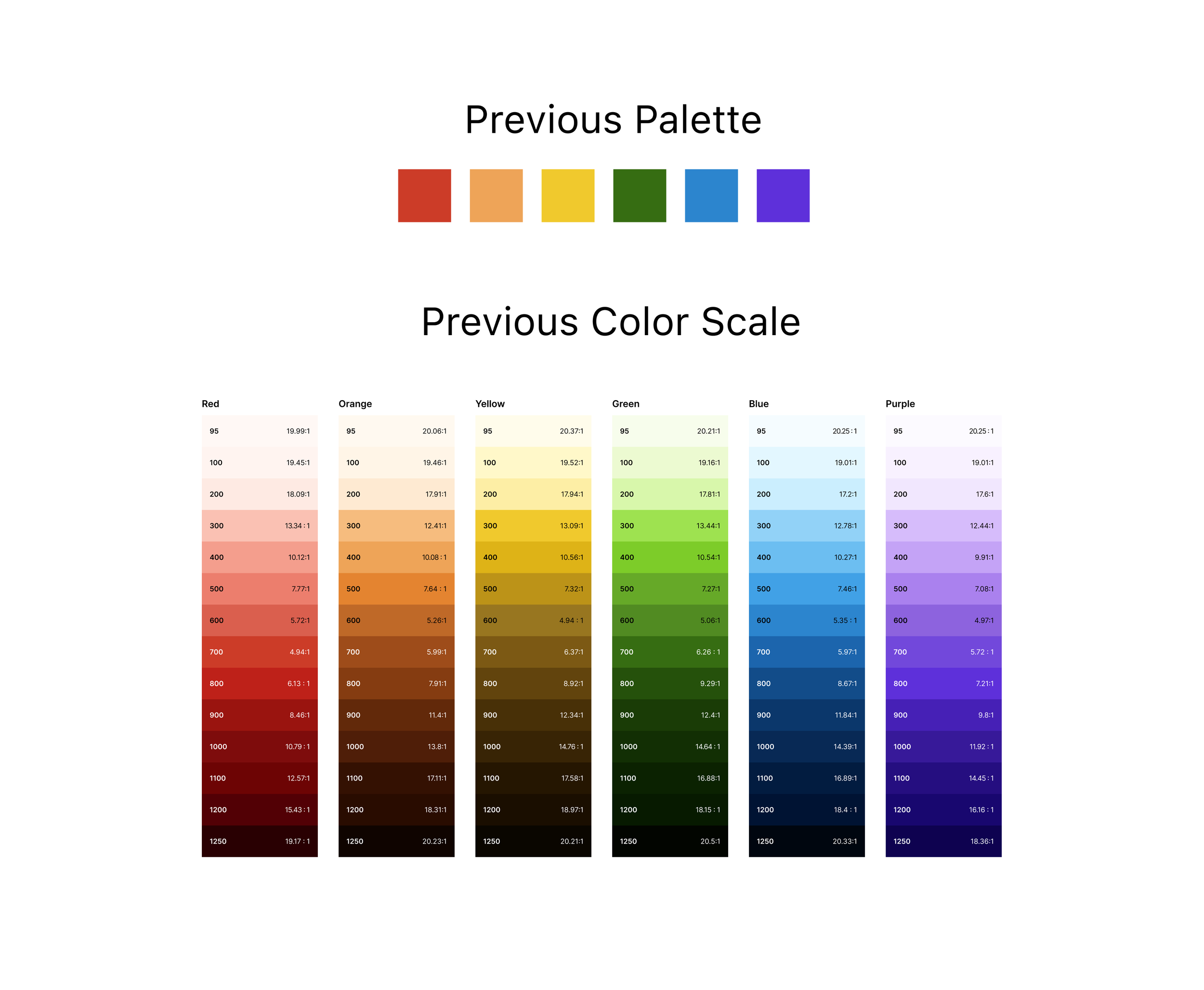
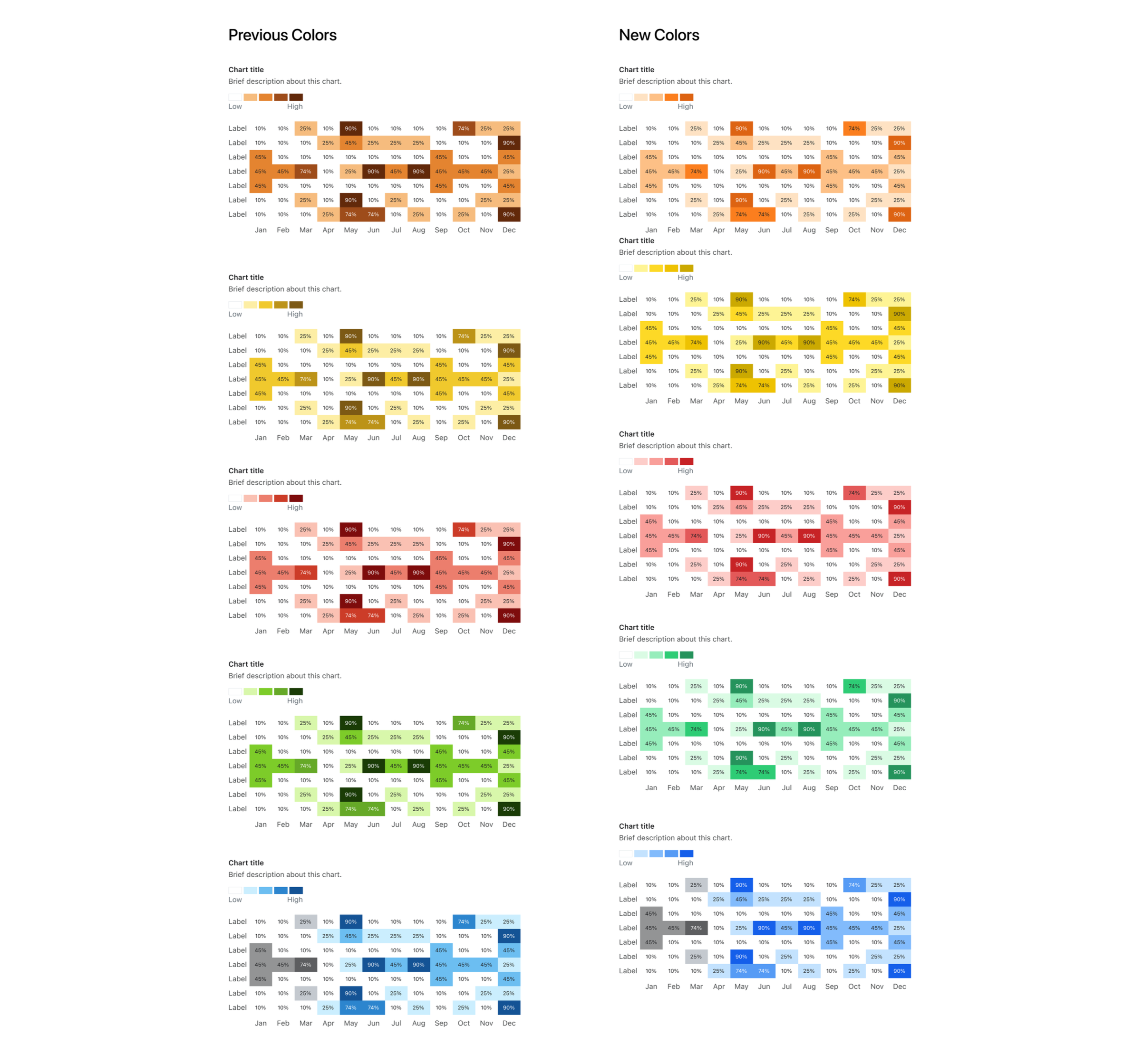
I worked on updating the use of semantic colors across all components and revised this group of colors to have more contrast as well. Below displays the comparison between the previous color palette and scales against the new color updates.
Data Visualization Sentiment Color Scales
The data visualization color scales required slight adjustments to improve contrast and distinguishability between values. Figure 1 shows the updated sentiment colors applied within the heat map component, alongside a comparison of the previous scales used in this component.
Testing for Colorblindness
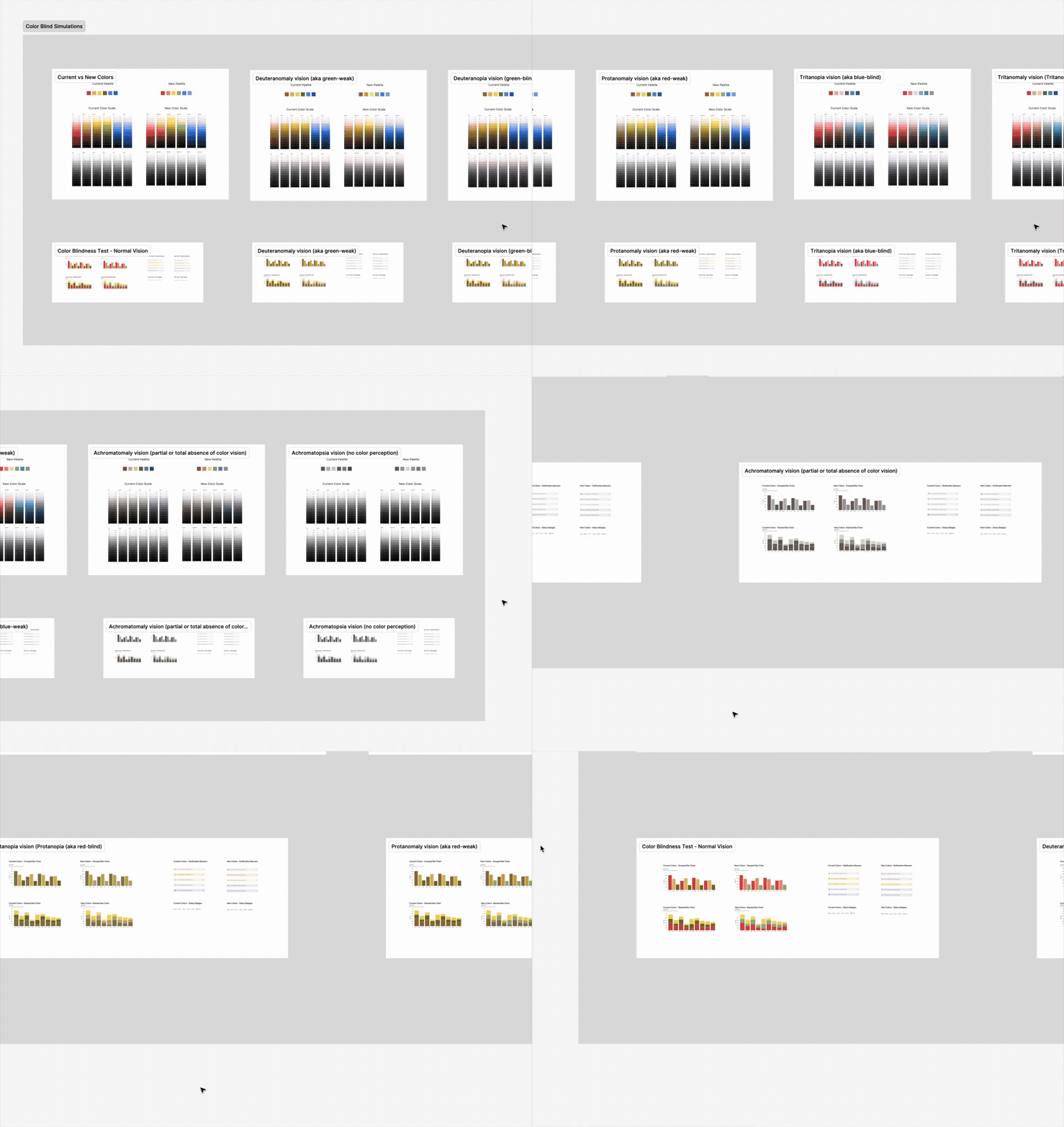
I evaluated the updated colors using color blindness simulators and conducted a small test with individuals who are colorblind. We also reviewed how the palette was applied across key components and data visualizations to ensure accessibility, consistency, and usability.
Updating the Semantic Colors in the Product
After finalizing the new semantic colors and scales, I documented all base color hex values in a shared spreadsheet. This provided engineers with a clear reference for updating tokens and implementing the new system efficiently.

